

Thee first image is taking up the whole double page. I really like the image, however I think that because it takes up the whole image it would be hard to see the text because of the brick wall.
The second image is one only one side of the double pages. I think that this looks the best because it will enable me to have more variety for the text options because it is a plain background, and I will not have to adapt the text to the background.

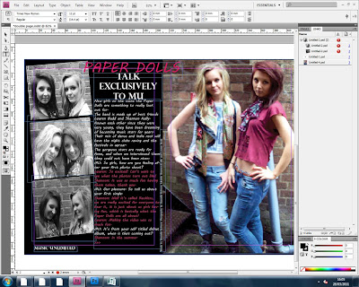
I have put the three images to the side of the opposite page to make the pages balance out. I really like the effect that the photos have on the page, I have put them in the style of photo booth images, as if they have taken the pictures in a photo booth themselves, enhancing the message to the reader that hey are friends. I have made the title of their names in bright pink and in MV Boli font, a bit more interesting than just having the same font as the contents page and front cover. By having the title overlap the image it makes the pages flow together a bit more.
I think it would look good to have the three images to the side of the double page spread in black and white effect, this is because I think it would look good to break up the images from each other and to have something different for the whole magazine, which may make it look more indie rock.

I think it would look good to have the three images to the side of the double page spread in black and white effect, this is because I think it would look good to break up the images from each other and to have something different for the whole magazine, which may make it look more indie rock.

The next step was writing the article of the interview. I did this is informal language because I wanted to relate to my audience and reader more, so it would be an easy read and not boring.
 After adding this I found the pages needed something more so I decided to see what it look like with coloured backgrounds.
When looking at backgrounds I went through a few colours that I thought would go with the rest of the double page spread, including the images:


When looking at backgrounds I went through a few colours that I thought would go with the rest of the double page spread, including the images:


Until I finally tried black background. I really like the effect of this and the way it looks, it really compliments the rest of the page and because some of the images are in black and white it further highlights them. I think the black looks different from any other doouble page spread because it is ver dominating but because the writing is in white and a shocking pink it can stand out easily.

In most magazine interviews there is a distinguishing factor between when the interviewer asks and question and the interviewee's response. So idecided to change the colour of the girls speech into the bright pink, this ties in with the title of their name so it all goes and flows well together.

I had to further develop the image when i looked at it I was not satisfied with the image because of the pipe in the corner of the image so I wen tinto paint to edit it out. I am really happy with the way this looks and has turned out.
This is my final double page spread:

No comments:
Post a Comment