The font choice is very important for the front cover text.
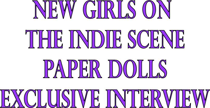


Boopee
I think all of these will look great on the front cover for my magazine.
The first font Perpetua Titling MT, is very similar to the on the used in my preliminary task. I really like the sharp edges on the letters and the way that it looks a bit rocky. Even though it doesn't have rough edges, I think it would go well with the magazine for the font. I think the font is quite sophisticated to it will go well for my target audience, who are 16-24 of both genders, so the titling may be relevant to both males and females.
The second font, Bradley Hand ITC is quite different as it is more relaxed and has smooth edges. I think the relaxed feel to it is really good, but the smooth edges would not go too well with the magazine front cover, as it is not edgy enough.
The last font type, Boopee, is very simple and bold. The uneven letters and edges make it different from all the other fonts. I think it looks a bit childlike, like it should be on children's magazine cover. My target audience is 16-24 so I don't think it would work too well for the front cover.
After looking at all 3 font types, I have picked the first font, this is because I think it related the most with my target audience and the rock vibe that the magazine will have.
No comments:
Post a Comment