Tuesday, 5 April 2011

Audience Feedback

Audience Feedback Record Sheet – Audience 1
Please rate the magazine for the following categories.  Circle the most appropriate.
5 = Excellent               4 = Proficient             3 = Basic          2 = Minimum              1= Poor          
Realism of front cover                                                                                      5              4              3              2              1
Layout and page design                                                                                   5              4              3              2              1
Integration of illustration and text                                                                 5              4              3              2              1
Use of language (mode of address)                                                                                                                5              4              3              2              1
Main Image (Framing and mise en scene)                                                  5              4              3              2              1
Variety of fonts and text sizes                                                                        5              4              3              2              1
Following  conventions                                                                                      5              4              3              2              1
Appropriate for audience                                                                               5              4              3              2              1
Appropriateness for purpose                                                                         5              4              3              2              1

Audience Feedback Record Sheet – Audience 2
Please rate the magazine for the following categories.  Circle the most appropriate.
5 = Excellent               4 = Proficient             3 = Basic          2 = Minimum              1= Poor          
Realism of front cover                                                                                     5              4              3              2              1
Layout and page design                                                                                   5              4              3              2              1
Integration of illustration and text                                                     5              4              3              2              1
Use of language (mode of address)                                               5              4              3              2              1
Main Image (Framing and mise en scene)                                                                                                                     5              4              3              2              1
Variety of fonts and text sizes                                                                       5              4              3              2              1
Following  conventions                                                                                    5              4              3              2              1
Appropriate for audience                                                                                 5              4              3              2              1
Appropriateness for purpose                                                                           5              4              3              2              1


Audience Feedback Record Sheet – Audience 3
Please rate the magazine for the following categories.  Circle the most appropriate.
5 = Excellent               4 = Proficient             3 = Basic          2 = Minimum              1= Poor          
Realism of front cover                                                                                        5              4              3              2              1
Layout and page design                                                                                    5              4              3              2              1
Integration of illustration and text                                                               5              4              3              2              1
Use of language (mode of address)                                                             5              4              3              2              1
Main Image (Framing and mise en scene)                                                  5              4              3              2              1
Variety of fonts and text sizes                                                                        5              4              3              2              1
Following  conventions                                                                                    5              4              3              2              1
Appropriate for audience                                                                              5              4              3              2              1
Appropriateness for purpose                                                                        5              4              3              2              1

From my audience feedback I have seen that the majority like the images and the text. Which means that it is relatable to the audience and the potential readers. The one that got the least marks for was the realism of the front cover. I am disappointed with the results for this because this factor was that was most important for me, the realism. I think that the main reason for this was that it does not look as much like a real magazine as I would have hoped, the image and text probably let it down a bit, I think the layout is good. Wick they seem to agree with.

Friday, 1 April 2011

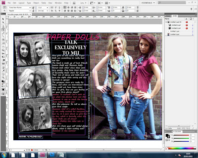
Final Double Page Spread

My double page spread is the one I am most proud of. This is because I worked relay hard on getting the layout correct and the images in the right place. I feel that I have achieved in making it look realistic and like a good magazine double page spread. 
When making the double page spread I made 2 different layouts that I could choose from. It was a hard decision to choose which one to use, so I decided to make further drafts for them both. For the first one I used one of my favourite images form the front cover and made it fill the whole double spread. For the second I sued another one of my favourite images and filled it to fit the right hand side of the spread. When looking at both spreads in full, I made the decision to choose the second layout. This was because when I included the article for the interview the writing would have blended in with the background of the first image too much.
I really like the second image, it is a great pose of them both, and they both look really nice and have an edge in their faces. I needed to edit the image because it looked like a pipe had come out her head and into her body. This is before and after I edited the image:
Before:
After:

I have edited the pipe out of the view using paint, I thought it would be OK if the pipe was left on the floor where it is, but after looking at it more I decided to edit that pipe out, so I went back to paint and did it again. After doing this I was able to focus on the other side of the double page spread.

The text on the page is very much similar to previous pages because I used the same font. The rest of the font is different, I decided to change it because I didn't want it to look too much the same as the rest of the magazine. Diversity is very important so I wanted to change the font, to MV Boli, this makes the writing look more sleek because it looks like real hand writing, I like this effect because it makes the interview more believable. I decide to make some of the text in bright pink and the rest in white to split the interview up. With real magazines in an interview the questions and answers are always different in some way, so I thought to go with the bright pink of the title that the bright pink would be a nice touch to the page. The colour is a girly one, but because it is bright pink as opposed to a pale pretty pink, this one has a bit of an edge and is less feminine, helping the effect of the magazine as an indie magazine.
The other images on the left side of the magazine are my favourite part of the spread this is because when choosing the layout I really liked the effect as if they are photos take in a photo booth, they look real and like the girls are having fun together. The pictures are in black and white, I like the effect of this with the rest of the page because it splits the images up from the rest on the whole magazine, making them different and something new for the reader to look at.
The black background was to avoid making the page looking too dull and boring. The connotation of this colour use could be that even though there is white and pink writing the black background could show that the girls have a darker side.

Final Contents Page


In the process of making my contents page I went designed 3 different possible layouts. I chose this one because I thought it would be the most interesting and functional. It is important to get the images in the right place and for the text to be good, so this is what I focused my attention on the most.
The main image has the same background as the one on the front cover but it is a long shot as opposed to a medium shot. This gives the reader something different to look at, and their poses are different to those on the front cover meaning that it is diverse. The both have their hands on their hips and are both laughing, this shows how they are together as a band and as friends, having a good time together shines through the image and on the whole page. The image at the top shows the free CD that comes with the magazine, by having an image as well as text for the CD it shows the reader exactly what they will be getting. The image below that is an image of my friend posing for a feature of what to wear at a festival. This relates to the reader if they are planning on going to a festival this year they can easily find out and get help (if they need it) on what to wear. The girl looks confident and happy in what she is wearing and in her pose so it can be relatable to girls who read it, as a good role model.
It is important for me to have more than one image on the contents page because it can fill up the page more and can make it more interesting to look at.

I varied the text on the list of contents changing the font from black to red, so that all the writing did not blend in together and look very boring. By including sections for the list of contents it highlights what each page belongs to which section, making it more functional for the reader to navigate through the page.

Final Front Cover


The process of making my front cover was considerably long. I firstly had to choose the orientation of the cover. I did this by going on publisher and creating three different layouts; I then had to choose which one I liked the most. I chose the first design because I thought it would be the most readable and flow the best. 
The image itself of Lauren and Shannon is the image I liked the most out of all them taken from the photo shoot. It gives off a great vibe about them, how they are smiling and back to back shows that they are friends and make it more believable to the reader that they are a band. The colours that they are wearing are very feminine colours, but they have an edge, the ripped t-shirt and striped vest make them more than just two girls in a photo, but represent them through the genre of music. Their hairs are quite messy meaning that appearance is not the most important thing, relating to the audience that even though they are on the cover of a music magazine, they are two normal girls. As there is only two of them it would be hard to establish who is the lead in the band and who is dominating the shot. However, the fact that you can see more of Lauren (left) it could be suggested that she was the leader of the twosome. 
The masthead is is the corner of the magazine cover, even though it is in the corner it still makes a big impact on the rest of the cover. The masthead is bold and black, contrasting with the image, standing out to the reader. It has a slight shadow underneath, showing how it can stand out that extra bit, and looks almost 3D, this may appeal to younger readers.When developing the masthead I wanted to make it bold, which I have done and to make it look diverse from all the other masthead's on the music magazine market. Even though I took inspiration from NME masthead, I think I have made it different so it doesn't look like a copy. I have made it so that the masthead overlaps the image, this is because the magazine name is not well established, if the masthead was behind the image then it would not be obvious. 
The text next to the masthead has the flash word 'NEW!' in a purple font, slightly bigger than the rest of the text, the other text is in white font, standing out against the brick wall background, so it is easier for the reader to see. The same applies to the text underneath the masthead, making the text all flow together. 
The main cover title is below the main image at the bottom left of the cover. Even though it is at the bottom of the page the red bold font helps make it stand out against the rest of the cover. The red colour can represent being passionate, and it is mainly the colour for rock music, meaning that the girls are not too traditionally 'girly' but they have an edge whilst still remaining feminine. 

Evaluation 7: Looking back at your preliminary task, what do you feel you have learnt in the progression from it to the full product?

Looking back on my preliminary task I learnt and found a lot of information that helped me create my main task.
I did my first bit of research, learning how to to deconstruct a magazine's front cover. I learnt some terminology about the different features of a magazine, such as the masthead and cover title. These words I did not really know before, so from learning it in my preliminary task I was able to adapt these words and use them in my main task.
When taking the image, I further developed my technology skills because I was able to use photoshop and edit the photos. I adjusted the image and uploaded it to InDesign and was able to work and navigate my way through this program.
I learnt about how important the text is on the front cover and contents page. The mode of address and style of lanuage was also something I learnt about, knowing how to address the target audience, which in this case was students.

The most important factor that I learnt from the preliminary task was the image on the front. When doing the research I had to evaluate the images on the front cover, this was the first time I had to do this, so I thought about what would I like to see on the front cover, and the answer was a famous person. The second magazine I looked at did this, making the magazine more desirable to look at. Since for my main task we had to our own photography and not images from the interent, so I had to take pictures of my friends posing as if they are a band. This made it more difficult to make the magazine more desrivbale to buy because the reader would not know who they are, but instead of using a msuical instruemnt, like the college magazines used a photo of the school, on the front cover I made it more interesting with two girls.
When making the contents page I looked at the three examples and saw that they were very simple and fucntional. I thought that that would be a good way for me to develop my own, by taking inspriation I was able to make my own contents page look functional for the reader and interesting using images. This has helped me in the main task, because my real contents page is quite similar to the one in the preliminary task. The plain background focuses all the attention on to the text and images, making there be no distractions away form them. The title had to be contents, so it would be more obvious and helpful to the reader, so they don't just bypass the oage and actually stop to look at it.


I have learnt a great deal of information from the preliminary task because I was able to adapt my knwoledge of college students and focus that as my target audeince, which incorperated the image and the masthead to suit a college student. The reserach I did for the task was much simplier than what I had to do in the main task, but it enabled me to learn about the features of a magzine and how to evaluate them. Form the research I could develop my own ideas into the preliminary task.

Thursday, 31 March 2011

Evaluation 6: What have you learnt about technologies from the process of constructing this product?

I have learnt a considerable amount about technology when doing the main task.
When developing my front cover I had to use InDesign. I learnt a great deal when doing this. I was able to crop the image using the move/drag tool I dragged the corners in to fit the A4 page perfectly.
When looking at the picture I went into Photoshop to edit the images. This program was new to me because I had never used it before, before started the main task we had a tutorial using InDesign so I was familiar on how to use it, but not for photoshop.
I was able to enhance the image by adjusting the curves and the exposure, this was so that colours were brighter and the image did not look dull. I was able to learn about putting different effects on the image for my double page spread, because I wanted to make some of the image black and white so I had to do that. Photoshop came in useful for my masthead as well because I was able to correct the edges around the letters. When first developing my front cover and putting my masthead on it, it was evident that the masthead looked messy. At first that was the effect I wanted but when looking at it the masthead did not look right, so I went back into photoshop and erased all the messy edges and made it look sharp.

Overall I have learnt a lot about technology for my magazine, I am now able to navigate through InDesign and be able to make the images and the layout of the magazine pages look good. From photoshop I have learnt how to edit images in a way that looks sophisticated and like a real magazine image. I am also able to use Blogger well and now know how to upload my work easily.


Evaluation 5: How did you attract/address your audience?

I attracted/addressed my audience by the following:

Use of language/mode of address:
I tried to use more informal language so that I could relate better to my target audience. The age group of my target audience is aged 16-24, both male and female. Even though I decided to use both genders as my target audience I think that from the way i have written it and my style of language that females would be more attracted to my magazine. The style of language that I used was very informal but language that was sophisticated enough for the older ages of my target audience. 


Use of font:
Through my font I tried to make the style as gender universal as possible on the front cover. I used font that had sharp edges and looked sophisticated as opposed to curvy and rounded edges, I did this to make it more un-bias towards females and more all rounded for all ages and both genders. In the double page spread I think that because the article is of two girls that I made the font more girly, having the writing slanted and in bright pink, so it may look more feminine, so it would attract my female audience.


Contents:
On my list of contents I tried to make it as exciting as possible, with a little mention of various famous stars, like Vampire Weekend and Warpaint. Since they are not the most popular artists I thought it would be more interesting for the readers, if they like the hear about new artists then they will be attracted to read my magazine. On the contents I made it clear to see that there was two exclusives, they were a chance to win Gig Tickets and free Vampire Weekend CD. I thought this would appeal to my audience because when doing my audience research the most popular promotion was free gig tickets.


Images:
All the images I have used on my blog have been for the benefit of the reader. The front cover image could be more bias towards females in my target audience because they are smiling together and look like two relatable normal girls, as opposed to traditional women on the front cover of magazines. The contents images include a feature - festival wear and the preview of the girls on the paper dolls interview. Since they are both girls you could say the magazine is more bias towards girl readers. The double page spread images are very female based because they look very friendly and happy together, giving off a good image to girls who read the magazine.


Masthead:
The masthead is not very feminine, this is because it has no feminine features, no colours and no pattern, it is just plain black with sharp edges. Meaning that it could attract male readers to the magazine.


Layout:
I tried to attract my audience with the layout of my magazine because I wanted it to flow well and be functional. The contents page has sections to divide the list of contents so that if the reader wanted to read predominately about the music they could look at that section, or if they wanted to read about artists/bands they could just look at the section below.

Wednesday, 30 March 2011

Evaluation 4: Who would be the audience for your music magazine?

My target audience for my magazine is both males and females, between the ages 16 and 24. However, I feel that from the way I have written my magazine and the colours and images I have used, I think it would be more biased towards females.

The ideal reader would be a student, preferably a girl.
She would have a very broad taste in music, with no favourite genre.
She would be interested in fashion as well as music, and love going to festivals and gigs.
She would be constantly listening to her i-pod and be up to date with the latest music and fashion magazines.
She would not be afraid to stand out and would be diverse from her friends, not conforming to the new trends.
She would listen to bands such as Lykke Li, Vampire Weekend, Sleigh Bells, Kings of Leon and popular stars like Katy Perry and Rihanna.
She would enjoy spending her time going out with friends or going to the cinema, and of course, going to gigs.
She would be the first in line for V festival and Reading festival tickets.

Evaluation 3: What kind of media institution might distribute your music magazine and why?

After looking at all five media institutions my first initial thoughts for which one will distribute mine was IPC Media or Bauer.
When I did my research into IPC Media I found that the distributed very popular music magazines such as NME, this would be a problem for me because most of my inspiration comes from NME magazine and the market would be too similar and the distributor may not choose my magazine because it could be seen to have the same audience and the same genre of music style.
Bauer magazine distribute a lot of music magazines such a Q and Kerrang! both are very different to my magazine. This would most likely be the one I would go with, our audiences are quite similar. My target audience is both genders aged 16-24 and Bauer's magazines target similar ages or older, so my magazine would bring something different by having a younger audience. From their list of brands they are very experienced in distributing similar magazines, meaning that it would be a successful partnership.
I definitely would not have EMAP distribute my magazine because their brands are not in any way similar to my magazine, for example they have magazines like Retail Week and Recycling and Waste Management. I do not think my magazine would fit in with this market.

Tuesday, 29 March 2011

Evaluation 2: How does your music magazine represent particular social groups?

My music magazine represents both genders, but I think it is more bias towards girls, main reason for this is because of the costume, the way the girls are posed and the location. Their costume represents normal girls with an edge, their riped shirts and ripped jeans and military boots really goes with the theme of indie music. Representing normal girls that are interested in that genre. The way they are posed shows that they are happy girls who are fun, and their closeness represents friends. this is an important image for my magazine because I did not want the wrong message about them to come across, they need to look comfortable around each other. Their appearance is very normal, two nice looking girls, not too extreme, this makes them much more relatable to the audience and they can warm to girls, helped by the fact that there is an interview with them, enhancing their popularity and likability. The location of the images helps to make it relatable. Unlike most magazines the images are not taken in a studio, I think this makes it more realistic and believable that they are real girls who are a new band.

Evaluation 1: In what ways does your magazine use, develop or challenge forms and conventions of real music magazines?

  Masthead:
My masthead was influenced from NME’s masthead. The way that it uses the abbreviations of words, New Music Express really inspired me to create a masthead just like it with my own words. I chose Music Unlimited because I thought that the name showed the diversity of the music industry and how there is no right or wrong of which genre of music you choose. When doing the audience research questionnaire I found that indie music was the most popular genre. This really stood out to me, because it is not a mainstream type of music I wanted to create a magazine that would speak and relate to my target audience who obviously liked that type of music, so that they could have a magazine that was filled with their favourite type of music. After deciding the name I thought that the masthead needed to be different from the NME one, so I went through stages of six different designs of the two letters MU and decided that the one I chose was edgy enough for the indie genre and different so that it would blend with the rest of the magazine cover. There is no other masthead on the market quite like my masthead; this is a great selling point for the masthead because it would not be mistaken for any other magazine. The masthead follows the normal conventions of a magazine front cover because it is very bold and stands out against the rest of the front cover; this is what magazines tend to do. For example Clash has very bold lettering, in white, but still quite similar to the way mine is standing out. NME has bold lettering but because it is already an established magazine the letters do not overlap the image on the front, as mine does. The reason I did this was because the name of the magazine would not be as obvious if it was behind the main image, so to get the name noticed it needs to overlap the picture. This could be seen as being non-conventional because normally with music magazines the people on the front cover of the magazine is the main focus of the whole magazine, but with mine I have put the masthead as the focus.

Mise-en-scene of images:The mise-en-scene of my images are very simple, following the conventions of music magazines. Most images in music magazines are very simple, this could surprise audiences because they may expect the musicians featured to be playing instruments or singing, however, using images of artists doing such things is extremely rare. In my research of music magazines out of all ten front covers, contents pages and double page spreads only one front cover included the artists holding instruments, only three contents pages included instruments or singing and only three double page spreads included instruments, this shows how unimportant the instrument playing seems to be to the audience and to the magazine images. For my main images I chose a brick wall as the background, because I thought it was simple enough to not take the focus off the two models, but it was interesting enough so that it was not just a plain background. The brick wall could relate to the genre of music because it is quite an ‘indie’ type of background, they are in a bit of a grungy alley way. I think this challenges the conventions of a music magazine because it is not in a glossy studio with the perfect makeup and hair, it is more realistic.
After taking the pictures I made a start on editing them, I wanted to make the picture of the two girls’ back to back stand out more, by adjusting the contrast and brightness. It was very important for me to make the picture look as realistic as possible, and not as if I have edited the image in photoshop. The images on the front cover of the magazines I looked at in my research look realistic and not edited; this is the look I was going for. When looking at the image before and after editing you can see a big difference in the colour of the magazine, this makes it obvious that I have edited the picture but in a way that it has improved the image, and shown how I have used ICT to edit the image well. When going through the editing stages I tried out increasing the image’s contrast considerably but it did not work because it was way too bright and not realistic. It is very important to relate to the genre of music and to the target audience so I thought that if the picture did not look realistic that the audience may not like it.
Costumes and Props:The costumes and props used in the images are very simple, when organising the photo shoot I asked the girls to wear clothes that had quite a ‘rocky’ vibe. One of them wore a t-shirt that was ripped and had the word ‘reckless’ on it, I thought that this was perfect for the vibe I was going for. The other model wore a stripped vest top and a scarf, the girls both look very fashionable at the same time of relating to my target audience which is 16-24. They both wore military boots, which at the moment are very in fashion, and are popular amongst my target audience, I know this from just looking around where I live and the places I go, nearly everyone is wearing military boots, the images therefore will relate to the target audience even more.
When doing the photoshoot, I thought it would look good to include an umbrella as a prop. The main reason I chose an umbrella was to show the girly nature of the band and the original tag line was going to be ‘let the sun shine on them’ so I thought it would have been good to have an umbrella in the picture, however, when looking at the pictures I did not like them with the umbrella, as I thought they looked too cheesy and would not suit the indie vibe.
People:The people featured in my magazine are very different from the usual music magazine cover girls. This is because they are young and quite girly girls. They make an unusual band because there is only two of them, when usually if there are girls on the cover of a music magazine there is more than 3 or they are solo artists. This makes not only the magazine unique but also makes the band more interesting and making them more readable. I think they challenge the normal conventions of a music magazine because they come across as two girly girls on the cover of an indie magazine, they might not be what some audiences may expect from this sort of magazine. The front cover could be more bias towards females, because they may look at the two young models and may aspire to be like them.
Font and Styles:The fonts I have used in the magazine are very simple, not taking any distraction away from the images and the main message coming across from the magazine. The font I used throughout the whole front cover was Perpetua Titling MT this was because I thought it would be good for the cover titles, because it is in capitals and it is not hard to read. When used bold it stands out greatly increasing the impact of the font because it can be seen from a distance easily. The only problem with it is that even when making it bold the letters tend to be a bit thin. This could make it hard to read but I made sure that I used colour and stroke to make sure it did not blend in with the background. I liked this font, because it is sophisticated for the target audience but nor boring, because it is very different from default lettering. I used this font also in the contents page because I thought it would look good if the lettering flowed throughout the pages. For the double page spread I did not use it for the main text, instead I used MV Boli, I used this font for the main text because I thought it would look good, as if it has been hand written, and it looks like quite a girly font, not one that may be used for a male band article. For the double page spread I used bright pink for the font colour, because again I wanted to stress that they are girly, but with a slight edge in their music.
Copy/Written Text:The text in my magazine is all original, for the front cover I made sure that the text was short and catchy. The titles, e.g. Plus! The 2011 Festivals and Gigs show how it is a new feature just for this week’s issue, making the audience more prone to pick up the magazine. My target audience is the type that would go to festivals and gigs regularly so it was important to get that on the front cover so that they would be interested. Using flash words like New and Plus makes it more interesting and making them stand out was my main objective with the front cover text. I have followed the normal conventions of a magazine because I used these flash words which a great deal of music magazines does use. I wanted the main cover title to be short and straight to the point, so that it would be easy for the audience to read from a distance.
On the contents page, there is the list of contents, for which I put a little description under each title to make it more interesting and more functional. I saw this in a  number of music magazine contents pages, so I followed the conventions of a magazine for that, making sure the descriptions were not too long, just a teaser. I thought it be appropriate to include an editor’s note, for which a lot of magazines do include, not so much music magazines, making it challenge the normal conventions of music magazines. I thought that this would be a nice touch to the contents page making it more realistic.

For the double page spread text I used informal language so it was more like a conversation rather than a straight forward boring interview.  All the text is original, and even though I did not actually interview the girls, because I know them I tried to focus on what they would actually say if they were in that position, making it more realistic and relatable to my target audience.
How is genre reflected in your magazine?The genre of my magazine is very important to it; this is because it is what defines a music magazine from other magazines. On the front cover, I included the words ‘Indie scene’ so that it could be obvious to the reader that the genre of music these girls play is indie, which is most likely to be the target audience’s favourite music genre, I know this from my audience research. I have followed the conventions of existing magazines because I have included the music type of the magazine on the front cover so that it is very obvious what type of magazine this is. I made sure that the font went well with the indie rock music style; if the lettering was curvy then it would not look good with the rest of the cover, so I went for a sophisticated font that had sharp edges. This was very much following the conventions of a music magazine, because the font will always go with the type of music that the magazine is representing.
Layout of the Front Cover, Contents Page and Double Page Spread:
The layout of my front cover is very conventional to normal magazines. The cover title is the biggest font and below the main image which is what it usually is. The masthead is at the top left of the magazine, this is very common for any magazines, so it thought it wise to put it there, because there must be reasoning behind why every magazine puts their masthead there. I think the main reason for it is because it is where most of our eyes directly go towards so it is important to have the masthead in that position. I have put the barcode at the bottom of the page; this is very conventional for a magazine. I decided to put it in the bottom right hand corner because that side of the cover was very plain and did not have anything on it, so I wanted to keep the balance of the whole cover. When looking at Echoes magazine I noticed how the text was all on one side and the image was dominating purely on the other side, so I wanted to follow the normal conventions of a magazine with text and image balanced out on the whole cover. The image is not as conventional as the other aspects of the magazine, the two girls posing as smiling back to back is a very rare image to appear on the front cover a music magazine, it is normally a rock band or solo artist posing quite moodily, for example, Kerrang! magazine would never really have two girls smiling on the front cover of their magazine. I included flash words like ‘plus’ and ‘new’; this is following the conventions of a music magazine because it is very common to see flash words on the front cover of a magazine, because it is including and inviting the potential readers into the magazine and interesting them to find out what is inside, I saw this when researching covers on NME magazine.
The layout of my contents page is very conventional because it is functional with a structured layout. The background is white which is the colour of most of the contents pages that I looked at in my research, nine of the ten contents pages I looked at had white backgrounds, and even the last one had a plain black background showing that it is the conventional design for a contents page. The layout of the contents page is quite simple and not cluttered. I included three images because I thought that if there was only one image and the rest being text the page may look boring and I want to interest my readers. The images are quite non-conventional because there is a picture of the CD that is a freebie in the contents page, so that the audience know what they will be getting, this could be similar to MOJO magazine, where they have the image of the CD on the front cover.
Like many of the other contents pages I have split the list of contents into sections, of ‘The Music’ and ‘The Stars’. This is a very conventional factor of the magazine, meaning that the reader can be directed to the page they want to go to easily. By using the images as a way of showing what number the page is on, I have achieved what most contents pages do and made the page so that I was following the forms and conventions of real magazines.

The layout of my double
page spread
 is reasonably conventional to real music magazines. The main image is on side of the double pages taking up that page. I tried to balance the pages out by including images on the other side with text in the middle. The three images on the side, could be unconventional because it is rare that you pictures in a different colour to the actual image. The black and white effect is a great way to break up the pages and separate the image form each other. I did not follow the forms and conventions, because out of all the research i did into music magazine's double page spread none of them had a main image and then a few on the other side. I took inspiration from NME's double page spread for the background, I think the black background looks great and goes well with the rest of the page, apart form NME none of the other magazines had a coloured background, so maybe this was not following the normal conventions of real magazines.

Conclusion:
To conclude I feel that I have stuck to the forms and conventions of real magazines throughout all these stages of creating my magazine. In many aspects I have followed the normal conventions to satisfy my audience, I wanted to change some things but overall I felt that it was important to make sure the magazine was not too different because I wanted my reader and audience to be able to relate and recognise that it was a music magazine and want to read it. I felt that my image on the front cover is a way of challenging these conventions giving the reader something new to look at and enjoy. The main objective for me was to make sure that the magazine looked like a real magazine, I think that my contents page looks quite similar to Clash magazine's contents page, this is because even though it is only one single page, the colours and image are quite similar.  

Monday, 28 March 2011

Step by Step Double Page Spread


Thee first image is taking up the whole double page. I really like the image, however I think that because it takes up the whole image it would be hard to see the text because of the brick wall. 
The second image is one only one side of the double pages. I think that this looks the best because it will enable me to have more variety for the text options because it is a plain background, and I will not have to adapt the text to the background. 


I have put the three images to the side of the opposite page to make the pages balance out. I really like the effect that the photos have on the page, I have put them in the style of photo booth images, as if they have taken the pictures in a photo booth themselves, enhancing the message to the reader that hey are friends.  I have made the title of their names in bright pink and in MV Boli font, a bit more interesting than just having the same font as the contents page and front cover. By having the title overlap the image it makes the pages flow together a bit more. 
I think it would look good to have the three images to the side of the double page spread in black and white effect, this is because I think it would look good to break up the images from each other and to have something different for the whole magazine, which may make it look more indie rock.

The next step was writing the article of the interview. I did this is informal language because I wanted to relate to my audience and reader more, so it would be an easy read and not boring.
After adding this I found the pages needed something more so I decided to see what it look like with coloured backgrounds.
When looking at backgrounds I went through a few colours that I thought would go with the rest of the double page spread, including the images:


Until I finally tried black background. I really like the effect of this and the way it looks, it really compliments the rest of the page and because some of the images are in black and white it further highlights them. I think the black looks different from any other doouble page spread because it is ver dominating but because the writing is in white and a shocking pink it can stand out easily.

In most magazine interviews there is a distinguishing factor between when the interviewer asks and question and the interviewee's response. So idecided to change the colour of the girls speech into the bright pink, this ties in with the title of their name so it all goes and flows well together.

I had to further develop the image when i looked at it I was not satisfied with the image because of the pipe in the corner of the image so I wen tinto paint to edit it out. I am really happy with the way this looks and has turned out.
This is my final double page spread: