
Thursday, 17 March 2011


List of Contents
This is what will be on the contents list and what will be in the magazine:
The Music
5. Track of the week
7. International stars
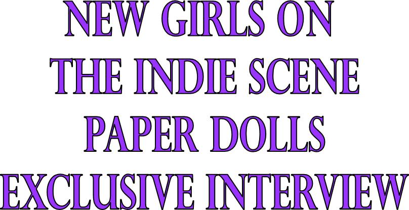
16. Paper Dolls interview
20. Reviews
30. Festivals and Gigs of 2011
41. Subscription to MU
42. Interview with Warpaint
44. This weeks survey
45. Festival Style
48. Free CD
49. Quiz
50. Your chance to win gig tickets
52. Up close
Some of the list will be in images to show what and who will be on the page. This will help the readers choose which page to go to because if they see a face or an image that they recognise it will be easier for them to relate to the magazine and turn to that page.
The Music
5. Track of the week
7. International stars
16. Paper Dolls interview
20. Reviews
30. Festivals and Gigs of 2011
41. Subscription to MU
42. Interview with Warpaint
44. This weeks survey
45. Festival Style
48. Free CD
49. Quiz
50. Your chance to win gig tickets
52. Up close
Some of the list will be in images to show what and who will be on the page. This will help the readers choose which page to go to because if they see a face or an image that they recognise it will be easier for them to relate to the magazine and turn to that page.
Flat Planning


After looking at both plat plans, I have seen that there is a lot of pages with very similar content, for example, for Rock Sound magazine (1st flat plan) there was a lot of 'One's to Watch' and for NME (2nd flat plan) there was a lot of Reviews. This takes up a lot of pages in the magazine. Seeing this has given me inspiration for when creating my own flat plan, to use a lot of the pages being reviews or something similar.
This is my flat plan for my own magazine Music Unlimited:
 |
| Click to Enlarge |
My flat plan of my magazine is considerably shorter than the two I previously looked at. I have included quite a lot of pages being the reviews and a few pages for adverts, which is what i have seen in the two existing magazines.
Friday, 11 March 2011
Step by step Masthead

The edges of the letters are really uneven.

So I used the brush tool with fill it out.

After using the eraser tool, I selected the inverse which is the two letters.

After selecting the letters I cut them so that I can paste them onto a new page.

I then saved the image for web and devices

I then placed it onto the front cover image so that I could see what it looks like against the image.
However, I was not pleased with the quality of the image, there was obvious white marks around the letters, which made the letters not look great. Altogether the image looked messy and uneven, so I went into paint and used the brush and eraser tool to edit it.

I then saved it and opened it into Photoshop and selected the inverse to paste onto my front cover.

The masthead looks much better on the front cover after I edited it in paint, now looks neat with no uneven edges.
Tuesday, 8 March 2011
Fonts on Front Cover
The font choice is very important for the front cover text.


Boopee
I think all of these will look great on the front cover for my magazine.
The first font Perpetua Titling MT, is very similar to the on the used in my preliminary task. I really like the sharp edges on the letters and the way that it looks a bit rocky. Even though it doesn't have rough edges, I think it would go well with the magazine for the font. I think the font is quite sophisticated to it will go well for my target audience, who are 16-24 of both genders, so the titling may be relevant to both males and females.
The second font, Bradley Hand ITC is quite different as it is more relaxed and has smooth edges. I think the relaxed feel to it is really good, but the smooth edges would not go too well with the magazine front cover, as it is not edgy enough.
The last font type, Boopee, is very simple and bold. The uneven letters and edges make it different from all the other fonts. I think it looks a bit childlike, like it should be on children's magazine cover. My target audience is 16-24 so I don't think it would work too well for the front cover.
After looking at all 3 font types, I have picked the first font, this is because I think it related the most with my target audience and the rock vibe that the magazine will have.
Thursday, 3 March 2011
Colours on Front Cover
I will include 3 main colours on the front cover, for the text. This is going to be the following:

When putting them together, I think these two colours work best with each other, the front cover image is going to be of two girls so I think these two are quite ‘girly’ colours. The red will look good as the flash word, e.g. PLUS as it is very bold it would stand out on the page. However, the red will stand out against the image of the two girls because the colours in their tops would clash too much with the purple text. The purple is not too girly that it will spoil the rocky vibe that the music magazine will have. I have chosen white instead of black because the black would have been very hard to seen because all the images are in front of a brick wall.
Subscribe to:
Posts (Atom)