Thursday, 3 March 2011

Colours on Front Cover


I will include 3 main colours on the front cover, for the text. This is going to be the following:
When putting them together, I think these two colours work best with each other, the front cover image is going to be of two girls so I think these two are quite ‘girly’ colours. The red will look good as the flash word, e.g. PLUS as it is very bold it would stand out on the page. However, the red will stand out against the image of the two girls because the colours in their tops would clash too much with the purple text. The purple is not too girly that it will spoil the rocky vibe that the music magazine will have. I have chosen white instead of black because the black would have been very hard to seen because all the images are in front of a brick wall. 


Tuesday, 1 March 2011

Masthead Development

I decided to call my music magazine 'Music Unlimited'. The main reason is because most music magazines include well known and established artists, but I want my magazine to include new music and not very well known artists from the Alternative and Indie Rock genre, so by calling it Music Unlimited it is showing how there is many broad genres of music, not just what is in the charts.


To give the name a bit of an edge I am having the initials 'MU' the main masthead on the cover, with the title in smaller print underneath. So I started to draw different font styles:


I decided to take font 1 and 4 further to develop, because they were the ones that stood out to me when looking at all six. I think these two also go the best with the Rock genre and would look interesting on a front cover.


Font 1:


Positives:
shadow effect is quite interesting
different from any other masthead on a music magazine
could be quite quirky if shadows were coloured

Negatives:
potentially hard to read from a distance (when on a news stand)
the non-shadowed part may look too slim, so could get lost in the magazine cover
not very 'rocky', which is important so that it can relate to the target audience


Font 2:


Positives:
no other magazine had a font like it
looks funky and interesting
would stand out on a front cover
rough edges go well with the rock music genre

Negatives:
if coloured may not look great
the 'U' may be hard to see that it is a U
may be too similar to NME magazine's masthead, which it was inspired by.


After looking at both mastheads, i decided to choose the second one as my final masthead.


The Photoshoot


Location of the photo shoot took place in Aylesbury, Buckinghamshire. The main reason for this is that this is where the models live, so I thought it would be more convenient to take the photos there. We tried to find a place where no one was around so there would be no distractions or on lookers.
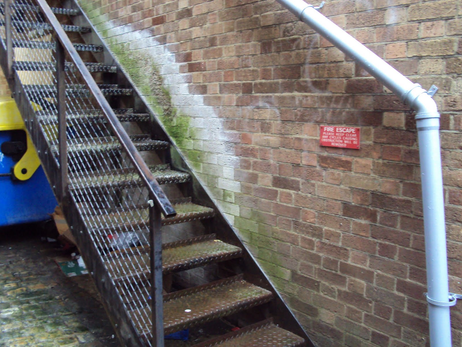
We found an alley way and decided it was light enough to take the pictures there, and I thought it would be a good look for them to be in front of a brick wall. These are the three place in which the pictures were taken:


For my Front cover and Double page spread I wanted to take a picture of two of my friends, to pose as if they are in a girl band. Using text messages I have contacted them asking if they could pose, and we had the following conversations:


Me: Do you think you and Lauren could pose for my media coursework? I have to take my own pictures for my magazine cover
Shannon: Yeah sure :) when?
Me: Not sure yet! It will have to be soon, maybe in the half term, would you both be OK with that? I can come to Aylesbury
Shannon: Yeah that's fine :) what day were you thinking?
Me: That's up to to you two
Shannon: We can do Tuesday :)
Me: Yeah that would be good. So I need you both to act as if you are a girl band, so wear what you want.
Shannon: Yeah :) OK cool
Shannon: I'm really sorry but we can't do Tuesday, can we do it Wednesday instead?
Me: Don't worry that's fine, thanks for doing it! So I will text you about what times and stuff
Shannon: Yeah OK sounds good :)
Me: Hey so what time would be good for you and Lauren tomorrow?
Shannon: Is one alright?
Me: Yeah :) so it would be good if you looked a bit 'rocky' like really made up eyes or lips, just to get that kind of vibe
Shannon: Yeah okay will do!

Lauren: Do you need us to wear heels tomorrow?
Me: no you don't need to!
Lauren: Okay, so what sort of stuff do you want us to do?
Me: Okay well, I was thinking just really relaxed poses
Lauren: Okay sounds good! I'll see you there then :)

The following images are the photos that I took of the two girls, I will not be using all of them in my magazine, just the ones I think are best:


As it shows in the images, for some of them i used an
 ought the umbrella would look good as it has a girly floral print, and my original concept would have been the models in dresses but i changed my mind as i thought it would look too girly. Unfortunately i do not like the way the pictures came out using the umbrella because i think they look too cheesy and does not go well with the rock concept. 
I am very happy with the way these photos turned out, I can pick a few for the magazine's front cover, contents page and double page spread with wide variety. However, a few of the image have a problem, it looks as if a pipe is coming out of one of the girl's head. This would not appear in a real magazine as they would photoshop it out or change the background. I think the best solution would be to not pick the pictures with this problem, or try to correct the image using photoshop or paint.
For the front cover I will use an image that is a medium close of the girls, because if it the image on the front cover is a long shot, it would be hard for the readers to see the girl's faces.
For the contents page, I will use an image that will not appear on the double page spread, this is because on my flat plan it will show how there will be a third page on the basis of the interview with the girls. I want this image to be a long shot because it needs to take up most of the page, because it is the main feature.
For the double page spread i want a long shot of the girls, either to fill the whole double page or just one side, I will have to make drafts to see what will look best. The other smaller images on the page will be close up of the girls, a maximum of three small images.

Organisation

Costumes:
These tops are the ones featured in the photo shoot, that the two girls are wearing.


Shows quite an edgy side to them, quite vintage and authentic looking, perfect for an indie girl band. 


This was the timeline for the process:


Personal Learning and Reflection on Research


Front covers
From my analysis of music magazine front covers, I have learnt about the different factors that make a magazine cover a success.

When evaluating the different covers I thought about the masthead and how important that was to the whole cover. When the orientation of the masthead was behind the main image that meant that the magazine is well established and do not need the whole name to be shown for it to be recognised by their readers. For example, for big well known magazine Rolling Stone you can hardly see the masthead, but with the few words you can see you can see that the signature style is that Rolling Stone. In contrast new and unrecognised magazine Clash needed the whole name being displayed for the readers to know what magazine they are picking up or buying.
The image itself brings the up most of importance when creating a magazine cover because if a potential reader does not like a particular cover that could make them not want to buy the magazine. From looking at the different cover images I think it is important that it includes a music star so that the reader can see someone they like on the cover making them buy it more. However, if I were to design a new music magazine then an unknown musician would work better, because that would benefit the person and the reader. It is also important that the picture appeals to both men and women and to a wide age range.  To do this I may need to find a picture with both men and women on, this has not been apparent for any of the magazine front covers that I have analysed, so maybe it is time for a music cover that includes both male and females. It is also a good thing for a cover image to stand out, the Vibe cover of Ciara, for example, is very daring and controversial and got a lot of attention.
I think the type of font used is also important because if it is too small it would not be noticeable if seen from a newsstand.

Contents Pages
From analysing contents pages of music magazines, I have learnt that it is important for it to be functional. By this I  mean that it needs to be easy to read and for the readers to be able to find the page they want to read.
I think that it is important for the page to not be cluttered so that the list of contents is clear to be seen and the images on the page do not distract the reader from looking at the contents.
Almost universally the contents pages all had white or grey backgrounds, making the main focus either the list of contents or the images on the page, this is what I will do for my own contents page.
It is key that the word contents is used somewhere on the page, because in the analysis I made Rolling Stone’s contents page did not use that word, and it did not look like a contents page, risking the reader just skipping past the page.
When designing my own contents page, I think I will take the most inspiration from Q magazine, because it mixed both a large image with organised list of contents. 

Double Page Spreads
From analysing double page spreads in music magazine I have learnt that it is imperative to have a large image of the main star. For most of the music magazines that I looked at they all had the image dominated the whole double page spread. Rolling Stone magazine had nearly no words in the spread meaning that the image was the most important. Other magazines like Blender included both a large image and words, half and half. This gives a good balance and is probably what I would like to do for my own spread.

The images used are all of musicians which is very important to a music magazine, having a big title of the name of the artist is a ‘double whammy’ meaning that if the reader did not recognise the image of the musicians then they may recognise their name, and vice versa.
It could also be good to have a colour scheme, like in the issue of NME magazine so that the two pages may flow better together. 

Audience Research

I have decided that my target audience is people of both genders aged between 16 and 24. This is because they are the age group I can relate mostly to. From my audience research, the questionnaire and the Find my Tribe quiz I have found a number of things. 
From the questionnaire I found that Indie music was the most popular music genre choice. This helped me with my decision of which genre the magazine should be. I also found that the majority do not read music magazines, this could be something to consider when making my own magazine. If the target audience would be smaller than I had originally planned. I noticed that the bands/artists they wanted to see on the cover, related highly on their preferred genre of music. The majority of the audience also said that the promotion that would most likely to persuade them to buy the magazine is Free Gig Tickets. This is the most desired freebie, so I will take that into account when creating my own magazine. 
From the Find my Tribe quiz I have learnt that the important factors that makes us fit into a 'tribe' is what entertainment we enjoy most, from TV to radio to magazines, it all matters. This is something that may help me in creating my magazine, knowing what entertainment feature my target audience may enjoy most.

Audience Feedback Moodboard

Music Moodboard


I have chosen the genre of a mixture of Alternative/Rock/Indie music for my magazine, main reason for this is because in my audience questionnaire, this genre of music was the most popular, and it is also a genre of music that I enjoy.


Audience Moodboard


This moodboard is purely based on the answers of the research questionnaire. These were the most popular answers, including Facebook, by having a social network site as the most used website, gives me an insight into how I may be able to get through to the target audience.